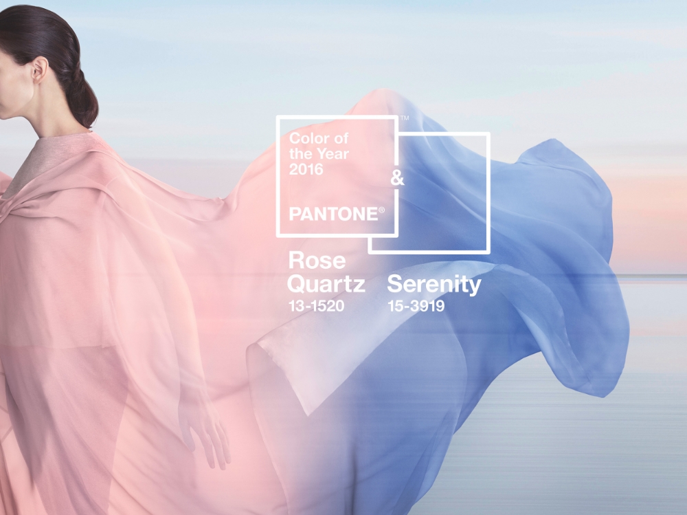
Pantone Color of Year 2016 — not one, but two colors this year. Rose Quartz and Serenity. Look for fashion, print goods and home decor designs to start sporting these hues. I'm thinking some new invitation designs will be popping up soon here at Charming Ink.
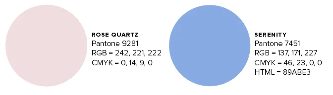
DIY Christmas Cards Freebie
Creative Market is giving away a free Christmas Greeting Cards set this week by Graphic Box. It includes both Illustrator and Photoshop versions of the files that are layered so you can easily edit them. Hand drawn elements, watercolor washes and a bear in a pom pom hat. What's not to love? affiliate link
Warm mugs for cold days
You never know how much you love your furnace until it goes out! Hubby fixed it last night (he's awesome and can fix anything), but it inspired me to work on some new mug designs. Nothing helps warm you up quicker than wrapping your hands around a hot mug of coffee.
Freebie: Goldish Photoshop Styles
Grab this freebie this week before it's gone! Do you love the gold foil treatments you see on graphics these days? Now you can quickly and easily create elegant gold stamping effects without the hassle of sourcing materials and becoming a Photoshop wizard with the Goldish Photoshop freebie from Creative Market. It includes tons of gold stamping effects and bonus patterns. (affiliate link)
Brand Refresh | Daugherty + Barron Real Estate
Sometimes businesses are looking for a Brand Refresh rather than a complete overhaul. This often makes sense if a business has a loyal customer base they don't want to alienate by completely changing their image. Daugherty & Barron was just such a client. They were not unhappy with their existing brand, but felt it could be more polished.
The first thing we discussed is that the actual name of the company "Daugherty & Barron" was not a part of the logo. Other refinements included making the d & b more symmetrical, mirroring each other as the two principal owners are indeed sisters. The + symbol was also a little vague – was it a cross? Turns out that it was and so we decided to make that more apparent. The pale blue also didn't have a lot of impact, so a stronger blue leaning more toward turquoise gives the logo more contrast and creates a more memorable color palette.
The website actually did get a complete overhaul. Before it resided as a free Blogger site that was very bare bones. D+B wanted a more robust and capable site that they and their agents could easily update themselves. Squarespace was the platform of choice and my personal favorite if a client wants a DIY solution for maintenance.
Mood Boards
Mood boards are everywhere and for good reason. They help focus an idea or theme so you can see if elements going to play nicely together. I enjoy creating Wedding Wednesday mood boards for Nan Lee Jewelry. They always include one piece of jewelry from her shop and show brides a complete vision for their special day. In this particular instance, I also photographed the Swarovski Crystal earrings.
Constellation Blue
Just a little Polyvore inspiration. Astronomy has always been a favorite pastime and so designing with "stars" as the focus helped me use navy in a really fun way. My normal inclination would have been to go with the warmer accents of gold, but silver won me over in this case.