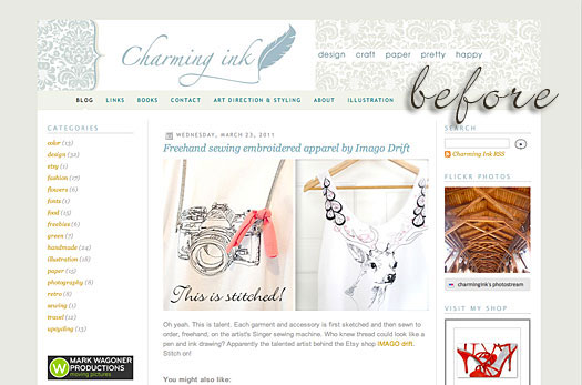
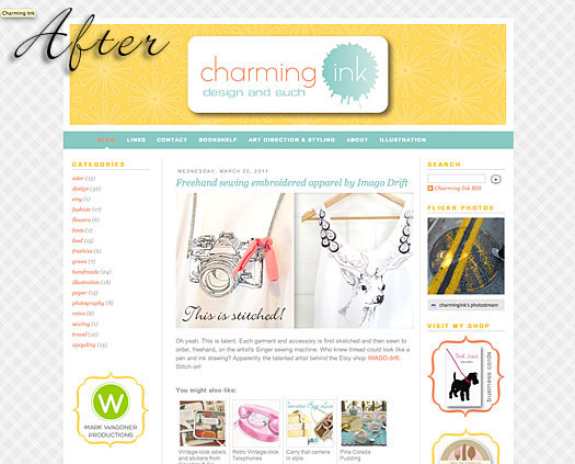
You may have noticed a pretty big change in the look of the site if you've stopped by lately. I got some comments from some readers (okay, my mom) that the subtle colors in the previous version of the site were a little difficult to read because of the contrast being low. I took this under advisement and started playing around with color to see if I could come up with a new palette that satisfied the contrast request while still matching my aesthetic sensibilities. It soon became apparent that a completely new direction might be in order and so I've redesigned the site based on one of my earlier visions for the charming ink logo. I'd love to hear your comments.