Sometimes businesses are looking for a Brand Refresh rather than a complete overhaul. This often makes sense if a business has a loyal customer base they don't want to alienate by completely changing their image. Daugherty & Barron was just such a client. They were not unhappy with their existing brand, but felt it could be more polished.

OLD LOGO

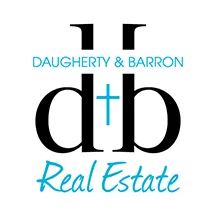
NEW LOGO
The first thing we discussed is that the actual name of the company "Daugherty & Barron" was not a part of the logo. Other refinements included making the d & b more symmetrical, mirroring each other as the two principal owners are indeed sisters. The + symbol was also a little vague – was it a cross? Turns out that it was and so we decided to make that more apparent. The pale blue also didn't have a lot of impact, so a stronger blue leaning more toward turquoise gives the logo more contrast and creates a more memorable color palette.

The website actually did get a complete overhaul. Before it resided as a free Blogger site that was very bare bones. D+B wanted a more robust and capable site that they and their agents could easily update themselves. Squarespace was the platform of choice and my personal favorite if a client wants a DIY solution for maintenance.
